Paint colors for master bedroom intended for the house
Practical guide to selecting ideal paint colors for a master bedroom that feel serene, timeless, and suited to your home.
Choosing the right paint color for a master bedroom is less about following the latest trend and more about creating a space that feels personal, calm, and cohesive with the rest of your home. The right color can anchor your decor, influence mood, and even affect how the room looks in different lights. Below is a practical guide to help you pick paint colors that work for a master bedroom intended for a house you live in for years.
Table comparing color families by mood and suitability
| Color Family | Typical mood | Best for master bedroom | Undertone guidance | Light absorption | Notes |
|---|---|---|---|---|---|
| Cool whites | Fresh, crisp | Yes if airy | Often blue/green undertone | Higher reflectivity | Pair with warm accents |
| Warm neutrals | Cozy, inviting | Yes | Usually yellow/peach undertone | Moderate | Works with wood tones |
| Greige | Balanced, modern | Yes | Mixed undertone, often neutral | Medium | Easy to coordinate |
| Soft grays | Calm, contemporary | Yes | Cool undertone common | Medium | Avoid stark contrasts |
| Taupes | Grounded, elegant | Yes | Brown/rose undertone possible | Medium | Flexible with textiles |
| Blues | Serene, spa-like | Yes | Blue undertone common | Medium | Use with white trim |
| Sage greens | Natural, restful | Yes | Green undertone | Medium | Pair with cream textiles |
| Lavender/petal tones | Soft romance | Moderate | Pink/purple undertone | Light | Use as accents or walls |
Compiled November 2026; check the provider's site for current details.
Understanding the goal of master bedroom colors
Your master bedroom should feel like a retreat after a long day. The color you choose sets the tone for rest, intimacy, and relaxation. Here are key considerations:
- Mood: Soft, serene hues work well for sleep. Bolder accents can add personality without overwhelming.
- Light: Natural light shifts color appearance throughout the day. Some shades lean warm, others cool, and both can be paired with different lighting.
- Flow: Colors should coordinate with adjacent rooms and common areas to maintain a cohesive home feel.
- Longevity: Choose colors you’ll still love years from now, avoiding fast-moving trends.
Neutral bases that stand the test of time
Neutral colors are the most forgiving and versatile for a master bedroom. They pair with almost anything and can be layered with textiles and art to change the mood without repainting.
- Warm neutrals: Cream, beige, taupe, and greige (a mix of gray and beige) create cozy, inviting spaces.
- Cool neutrals: Pale gray, stone, and soft greige with cooler undertones add a modern, calm vibe.
- Off-white options: Eggshell, pearl, and linen whites reflect light beautifully and reduce stark contrasts.
Tips for choosing neutrals:
- Look for undertones under your lighting: a warm room can make cool neutrals feel washed out. A cool room can make warm neutrals seem yellowish.
- Test swatches on multiple walls and at different times of day to see how they shift.
Table of undertone guidance and when to use Outstanding mens bedroom ideas intended for warm
| Undertone | Description | Good with | Caution | Light effect | Example colors |
|---|---|---|---|---|---|
| Cool blue undertone | Subtle blue tint | White trim, navy accents | Can feel cold if overused | Refreshing in bright light | Crisp whites, pale blues |
| Warm yellow undertone | Creamy warmth | Wood furniture, tan textiles | Can read off-white in dim rooms | Cozy in low light | Soft greige, eggshell |
| Pink/rose undertone | Warmth with softness | Blush textiles, warm woods | May skew girlish in large amounts | Gentle glow | Toasted almond, rosy gray |
| Green undertone | Olive/sage hint | Plants, natural fabrics | Can muddy neutrals | Natural feel in daylight | Sage, olive, clay |
Compiled November 2026; check the provider's site for current details.
Soft colors that promote rest without fading into the walls
If you want more personality than a neutral, consider soft colors that still read as soothing in a master bedroom.
- Blues: Powder blue, seafoam, and dusty navy can feel tranquil and timeless.
- Greens: Sage, sea-foam green, and muted olive bring a natural, tranquil vibe.
- Lavenders and mauves: Light lavender or dusty mauve can feel luxurious without being overpowering.
- Warm blushes: Very light pinks or blush tones add warmth and a touch of romance.
How to pick among them:
- For a cooler feel, lean into pale blues or greens with blue undertones.
- For warmth, choose blush, warm sage, or greige with warm undertones.
- Pair any of these with white trim or lighter ceilings to keep the room balanced.
Understanding undertones and why they matter
Undertones are the hidden hues that show through a paint color. They can dramatically change how a color reads in your room. Outdoor Kitchens: How to Plan, Build, and Enjoy Your Backyard Culinary Oasis
- Pink undertones with pale pinks or taupes can read warmer and more romantic.
- Yellow undertones in off-whites or creams can brighten a space but may shift color in different lights.
- Green or blue undertones in grays and blues keep the color grounded and cohesive with nature-inspired decor.
To identify undertones:
- Compare your color swatches against pure white and pure black. The undertone is the color you see as a faint tint.
- Place swatches near natural light and artificial light to observe shifts.
Lighting and how it transforms paint color
Lighting is a powerful ally or a tricky adversary when choosing paint colors.
- Natural light: A north-facing room will bring cooler tones. South-facing rooms enhance warmer tones.
- Artificial light: Warm LED or incandescent bulbs (2700K-3000K) bring a cozy vibe. Cool bulbs (3500K-4000K) emphasize crisper colors.
- Layered lighting: Use a mix of overhead and task lighting to control mood and color perception.
Practical tips:
- Always test paint samples on the wall, not a card, and observe them at different times of day.
- Use dimmable lights to adjust mood without repainting.
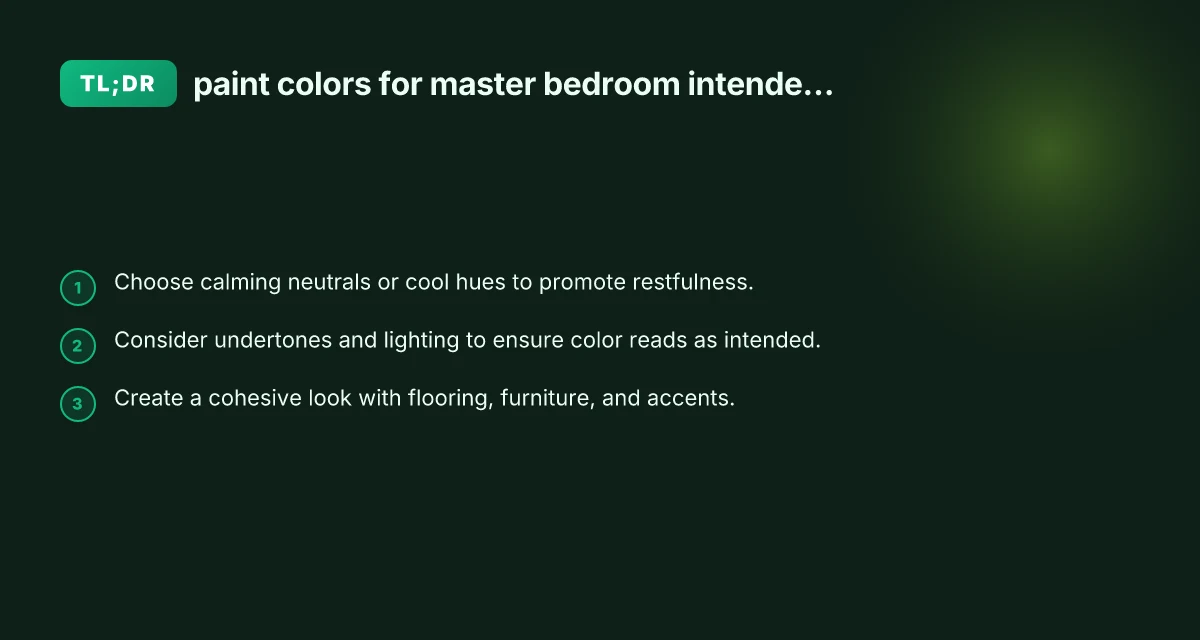
Coordinating with flooring, furniture, and textiles
A master bedroom’s color should harmonize with the floor, bed, and curtains. Outdoor Kitchen: Create a Functional, Beautiful Space for Al Fresco Living
- Floors: Light wood or neutral carpet pairs well with most wall colors. Dark floors can anchor a lighter wall color for drama.
- Furniture: If you have dark wood furniture, lighter walls can create contrast and make the room feel airy. Conversely, medium to dark walls can ground lighter furniture for a cozier vibe.
- Textiles: Curtains, bedding, and rugs tie the palette together. If you choose a bold accent color in textiles, keep walls in a more neutral tone to avoid overwhelm.
Suggested pairings:
- Neutral walls + blue or green accent textiles
- Soft gray walls + white trim + warm wood furniture
- Beige walls + black metal accents + cream textiles
A simple table: comparing popular master bedroom color families
| Color family | Typical undertone | Best room vibe | Pros | Cons |
|---|---|---|---|---|
| Soft blues | Blue undertones | Calm, airy | Reads as peaceful; pairs with cool lighting | Can feel cool in low light; may clash with warm wood accents |
| Sage greens | Green undertones | Natural, serene | Works with plants and natural decor | May appear dull in small rooms without good lighting |
| Warm beiges/taupes | Warm undertones | Cozy, timeless | Flexible with most furniture | Can drift yellowish in strong daylight; needs careful companion colors |
| Gray with warmth | Gray with warm undertone | Modern but cozy | Versatile; suits many styles | Can feel cold if undertone is too cool or lighting is harsh |
| Lavender/mauve | Purple undertones | Luxurious, soft | Distinctive without being loud | Can be polarizing; needs balanced accents |
Practical testing plan before committing
- Start with a core color family: pick two or three shades that feel right.
- Create large test patches: paint a 2x2 foot square on multiple walls in your master bedroom.
- Observe at different times: morning, afternoon, evening, and under artificial light.
- Use color-matched fabrics as references: drapery and bedding can reveal how the wall color will feel next to textiles.
- Check consistency with the rest of the house: especially rooms you can see from the master bedroom or those that share a hall.
Table: Practical testing plan before committing
| Step | Action | Timeframe | What to observe | Tools | Decision signals |
|---|---|---|---|---|---|
| 1 | Paint swatches on wall | 1 day | true color vs sample card | Swatch chips, daylight | Color match to room feel |
| 2 | Observe at different times | 3–5 days | morning vs evening | Light meter (optional) | Consistent mood shift |
| 3 | Test with textiles | 1–2 days | how curtains, sheets read | Fabrics, sample boards | Cohesive palette |
| 4 | Check with flooring | 1 day | contrast level | Floor swatches | Balanced contrast |
| 5 | Mock trim/ceiling | 1 day | edge transitions | Edge tape | Clean boundaries |
| 6 | Final decision | - | overall harmony | N/A | Confident choice |
Compiled November 2026; check the provider's site for current details.
Trim, ceilings, and accent ideas to complete the look
- Trim and ceilings: White or off-white trims brighten the room and frame walls cleanly. A slightly cooler ceiling can help walls read warmer.
- Accent walls: If you want a focal point, consider a soft accent on one wall. This works well in larger master bedrooms.
- Textural variation: Matte or eggshell finishes on walls with a satin finish on the trim create depth without glare.
- Accents: Use textiles, art, and decor in complementary colors to reinforce the palette rather than competing with it.
Final considerations for a successful selection Office Chairs: A Complete Guide to Comfort, Support, and Productivity
- Start with the mood you want and then choose a color family that supports it.
- Consider the house’s overall palette and how the master bedroom will flow with nearby spaces.
- Test, test, and test again. A color swatch on a card is not enough. You need wall-scale testing under actual lighting conditions.
- Keep finish in mind: not all whites or neutrals are created equal. The sheen (matte, eggshell, satin) affects how light interacts with color.
Recommendation
If you want a timeless, soothing master bedroom that adapts well to evolving decor, start with a warm neutral base or a soft blue-green. Neutral bases like greige or warm beige provide flexibility and warmth, while pale blues or greens add a serene, sleep-promoting edge without overpowering the room. Test both families on multiple walls and in different lighting, then layer textiles and accents to finalize the palette. With careful consideration of undertones and lighting, you can choose paint colors for your master bedroom that feel both inviting and enduring, perfectly suited for your house and your life there.